Overview: This workflow was designed to increase conversion rates by guiding users easily and efficiently through online purchases. Though it was designed mainly for web, the design had to be flexible enough to accommodate possible in-app purchases within native applications. Required input fields were analyzed and organized according to priority, and simplified as much as possible. Regular user testing was used to validate many small decisions during the design process. Emphasis was put on making the user feel reassured and confident about their purchase.
Challenges: The main challenge of this project was that it had to be flexible enough to work for a large amount of varying digital and physical products. It had to work with a number of different products, teams, entry points and technologies to form a seamless experience. The company was in the process of unifying their brand and presence, so a minimalist design was chosen to maximize compatibility with existing product branding. If you look closely at the order summary, you can see an image in the dark background. This image would be different depending on what the user is purchasing, therefore connecting a bit of product personality with the minimal design.
The design went through many iterations to adapt to various stakeholder decisions made throughout the process. For example, the checkout originally required an account sign-in before the user could purchase a product. That workflow would allow for less input fields during checkout because much of the information would have been collected from the user’s account. However, as a decision was made to delay sign-in further into the process, the number of mandatory input fields were changed accordingly.
 Billing Information: This first screen requires billing information (for both digital and physical products) for tax calculations. As the user enters their information, their order summary is updated with the new amount. The call-to-action “Continue to Shipping” gives the user a sense of what to expect next. If the product is purely digital and requires no shipping, the shipping step of the checkout process is removed completely and the call-to-action changes accordingly.
Usability Tested Extras: A secure server icon placed near the total, the refund policy and the company’s logo were all added to increase a sense of assurance and trust for the user. As part of the order summary these elements would be present throughout each step of the checkout process. User testing helped determine the optimal placement, look and content.
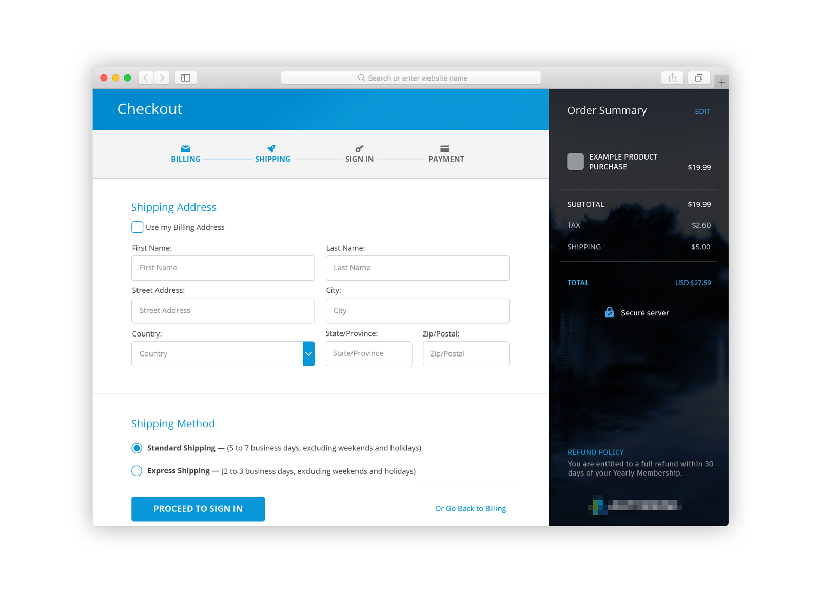 Shipping Information: This step only appears in the workflow if the user is purchasing a physical product. The call-to-action leads the user to the company’s single-sign-on page (hosted and maintained by a separate team) which uses the same visual language and colour scheme. After the user signs in, or creates an account, they are lead back to the final step of checkout.
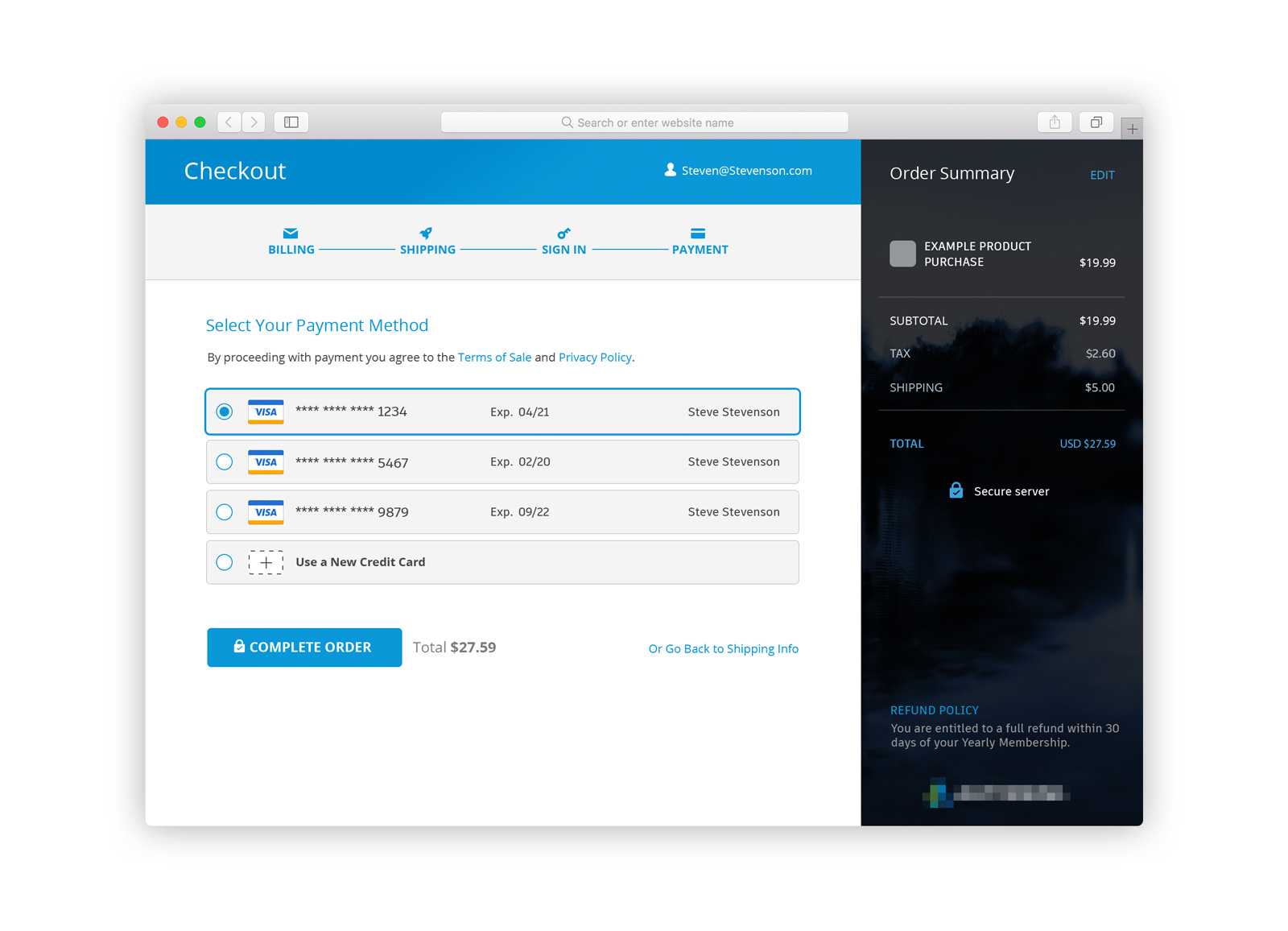 Payment Options: The payment method page will look different depending if the user has saved payment information associated with their account. In this example, the user has multiple cards on their account, with the option to add a new one. Although most users will not have as many cards, this mock up shows how multiple cards would be displayed.
The call-to-action clearly communications that this is the last step. The total is placed next to the button again to increase clarity and assurance.
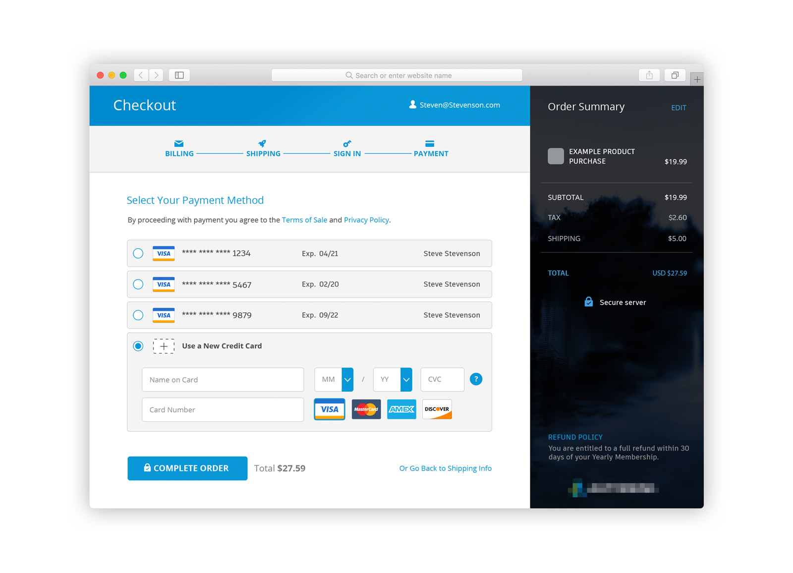 New Payment Option: This screen shows what the user would see if they chose to new a new credit card, though they have existing cards on their account. Their payment information can be edited later in their account settings.
 Order Confirmation: This confirmation shows the order has been approved and associated information. The call-to-action to download software is below. Additional resources and reading can be found at the side.
Alternative Design: The design below showcases an earlier iteration of the checkout design. It features an accordion-style workflow that keeps the user on one page for the entire process. It experimented with limiting the billing information to two fields (for digital products), determining taxation based on zip/postal codes and country. This workflow was designed with the requirement that account sign-in happen before the user is able to checkout. Once sign-in was moved into the checkout workflow, the other design option was deemed less disruptive.


